
 Website development
Work / Feel True Wafer
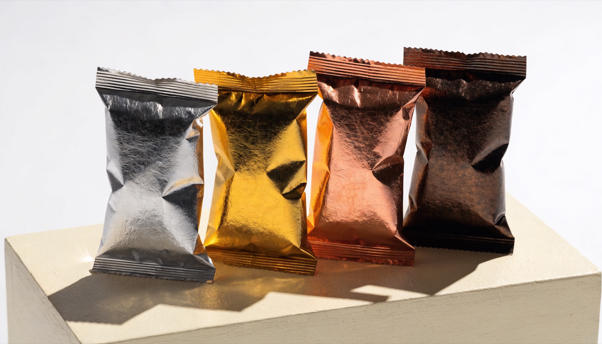
A wafer that reads across the aisle.
An identity and packaging system for a snack range built to hold its own on a crowded shelf.
- Client
- Feel True Wafer
- Discipline
- Branding
- Year
- TBC
- Markets
- Azerbaijan
The Challenge
Each flavour had been designed on its own. On shelf the range read as four different products from four different companies, and the block disappeared next to competitors.
The Idea
Design the system, not the pack. One structural grid, one colour rule per flavour, one photographic treatment, so a new flavour joins the range without a new design round.
The Approach
We rebuilt the mark to survive at sixteen pixels and at six metres, templated the regulatory panels per market so compliance never touches the front of pack, and shot the range in a single block.
The Work
Brand strategy, identity, packaging system, key visual, product photography and rollout guidelines.

The Result
0Flavours in system
0Design round per launch
0Shelf visibility
Placeholder figures. Real numbers go here once the client approves them for publication.
Next project
Website development
Got a brand to build?
Have a challenge, an idea or something that could be better?